CRM Adoption
Challenge: New user onboarding to improve adoption during migration
Tools:
Miro
Figma
Usability Test
Material Design M3 Design System
Deliverables:
Personas
Site Map
Sketches
User Flows
User Stories
Affinity Map
Wireframing
Empathy Map
Interactive Prototype
Role: Lead UX Designer, User Researcher
Timeline: 3 months
Challenge
A non-profit Benefits department uses a CRM platform to manage customer data. Currently, the client encounters time-consuming and manual processes, redundant data, and maintenance requiring a 3rd party's support. Discovery of secondary research insights through competitor analysis and literature reviews, revealed common CRM pain points include:
Overwhelm by the massive amount of functionality and content
Cumbersome troubleshooting
Poor data quality due to low employee adoption
Inaccurate or unactionable data
Solution
The objective is to create an intuitive, interactive, and simplistic solution that is clean and easy to digest to attract users and increase adoption rates. From survey insights, the team preferred video tutorials, supplemental text documentation, and email support the most, and the most common use case is for reporting. Interview insights revealed that migration is an opportunity to streamline processes, clean data, improve integrations, and target groups more appropriately. Along with more relevant offerings and capabilities, the new software is supported by their internal IT.
As the lead UX Designer, I led discovery workshops to gather insights through surveys and interviews. I researched and synthesized findings in empathy maps, affinity maps, and user personas. I designed from low to high fidelity and validated the designs through usability testing. The solution reduced cluttered content, improved navigation, and embedded resources to improve usability while incentivizing through gamification and rewards. I led the UX strategy to create an intuitive, interactive, and easy-to-use solution to motivate users and increase tool adoption.

Process
Approach
I reviewed literature on CRM applications and benefits along with analyzing competitors in the current marketplace. A deeper dive into Salesforce revealed common pain points in overwhelming content, difficulty troubleshooting, complicated form-building, and cost.
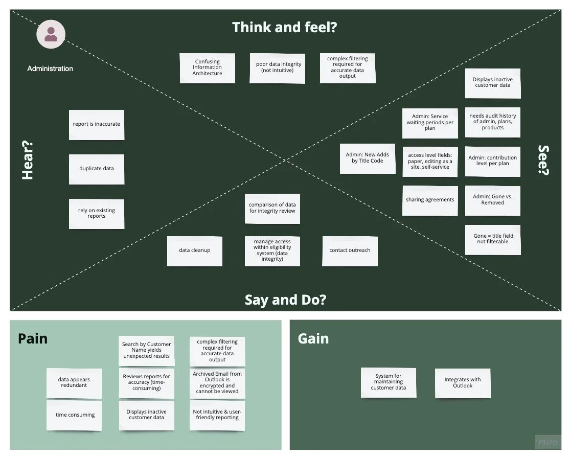
I hosted a workshop to share insights with the client and collect survey responses and interview the primary users of the existing system. Research synthesis revealed that common pain points across the user groups including:
Non-intuitive information architecture
Time-consuming and manual processes
Complex filtering for reporting
Data cleanup to remove undesirable outputs
Maintenance requires scheduling with a 3rd party
I focused my UX efforts on the dashboards, onboarding resources, and file import to provide the team with a wide array of relevant offerings to help in the early stages of the migration.
-
I discovered insights that CRMs leverage business analytics for customer retention, improve customer service efficiency, and improve efficiency and effectiveness for marketing and sales initiatives. Many competitors mimic Salesforce offerings, however, as the leading CRM solution, it delivers more customization, seamless integrations, and user-friendly experiences.
-
Survey responses showed that the primary use case is for reporting. The team prefers video tutorials, supplemental text documentation, and email as support formats at the same rate.
The Data Analyst prefers the ability to import from the front-end rather than solely rely on IT. The Director of Sales noted that connections between campaigns and marketing outreach would add ease to the marketing efforts.
-
User stories, user story maps, empathy maps, affinity maps, red routes, and site map.
User flows of data maintenance, data mining, and reporting.
-
I designed dashboards, onboarding resources, and a file import system from low to hi-fidelity: sketching concepts, wireframing flows, and prototyping an interactive solution. I validated with key users throughout the process.
Deliverables
User Interview Participants as Personas
-

Senior Director, Strategic Initiatives
Leading the execution of key strategic initiatives, she oversees member experience for the Plan, including marketing communication strategy, enrollment operations, and technology.
-

Data & Reporting Analyst
She manages the plan databases, analyzes and forecasting trends, and creates dashboards and in-depth reports. She answers logistical questions about accounts from the wellness program.
-

Senior Benefits Administrator
She oversees the eligibility and invoicing system. She is the go-to person for benefits-related questions and inquiries about enrollment.
Framework
How Might We
How might we implement meaningful onboarding features to improve ease of use for new users?
How might we simplify complicated experiences?
If using 3rd party integrations, how might we create a seamless experience navigating between these different spaces?
How might we improve navigation between different pages?
How might we include training and support within the platform?
Jobs to be Done
As a Marketing & Strategy user, I need to…
Track opportunities
Reporting
…so that I can gain new territories for enrollment and align strategy with business needs.
As a Data Analyst/Benefits Administrator, I need to…
Manage customer data
Plan management
…so that I can update customers with pertinent plan changes.
Design
CRM adoption strategy through customized dashboards and new user onboarding resources leveraging Salesforce Lightning design system.
Dashboard & Onboarding Tools
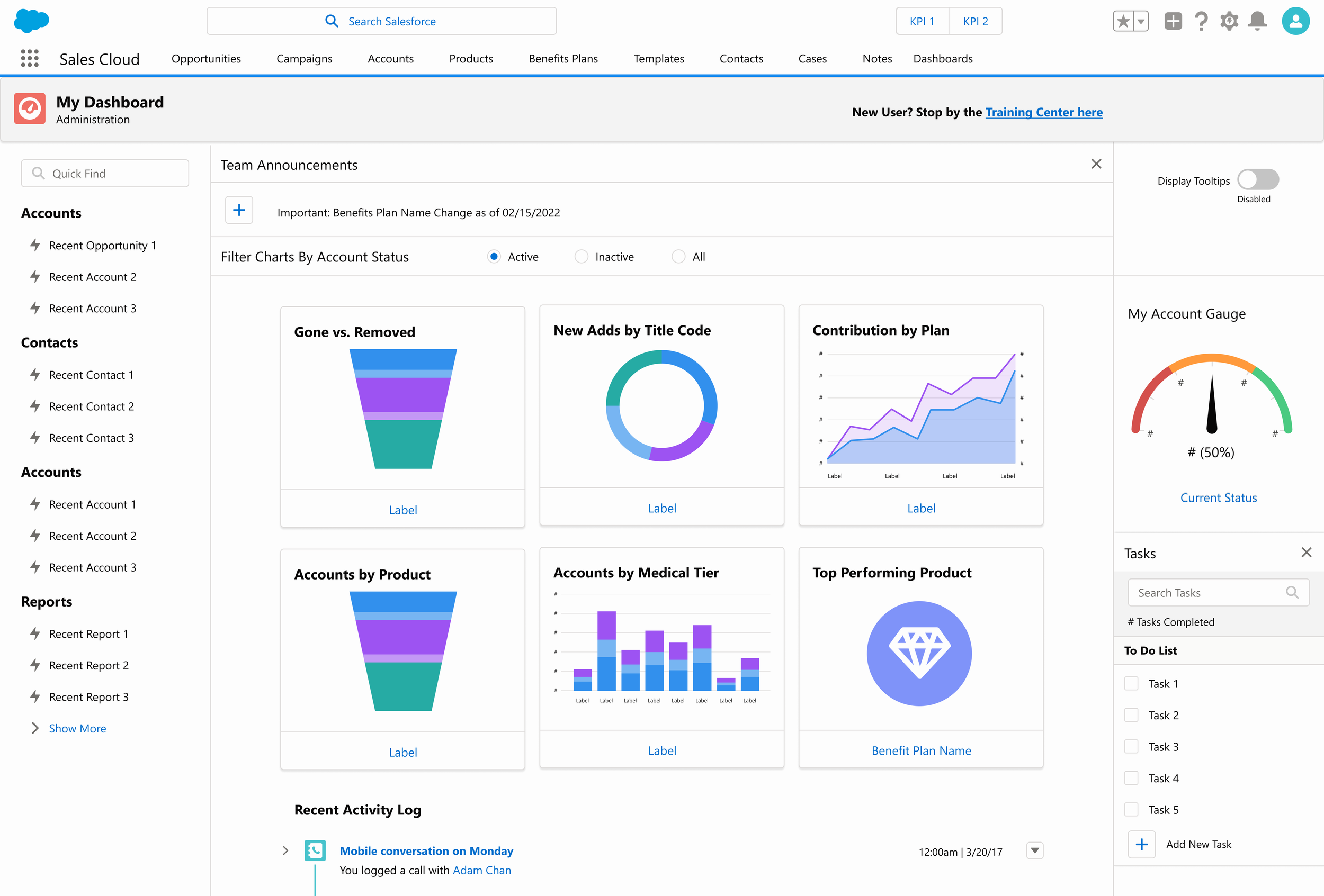
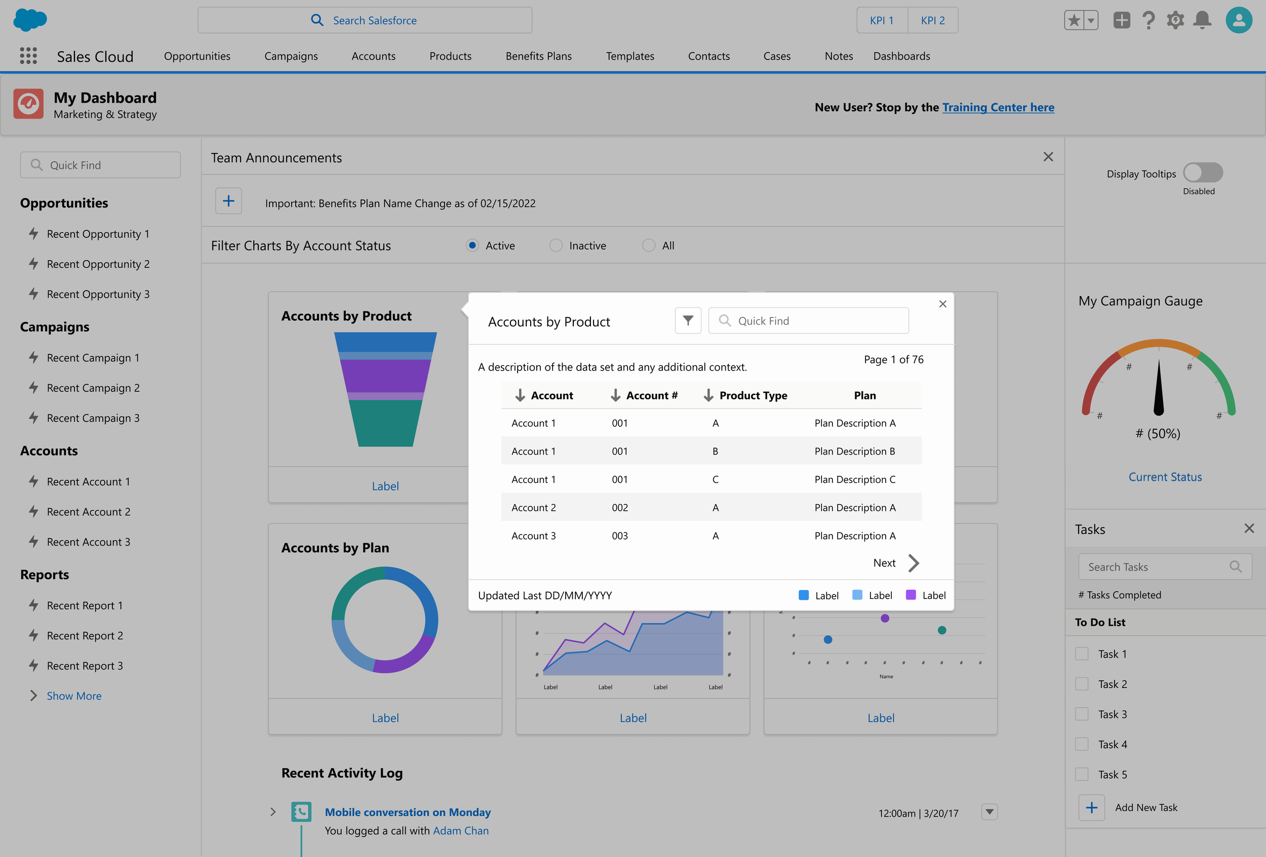
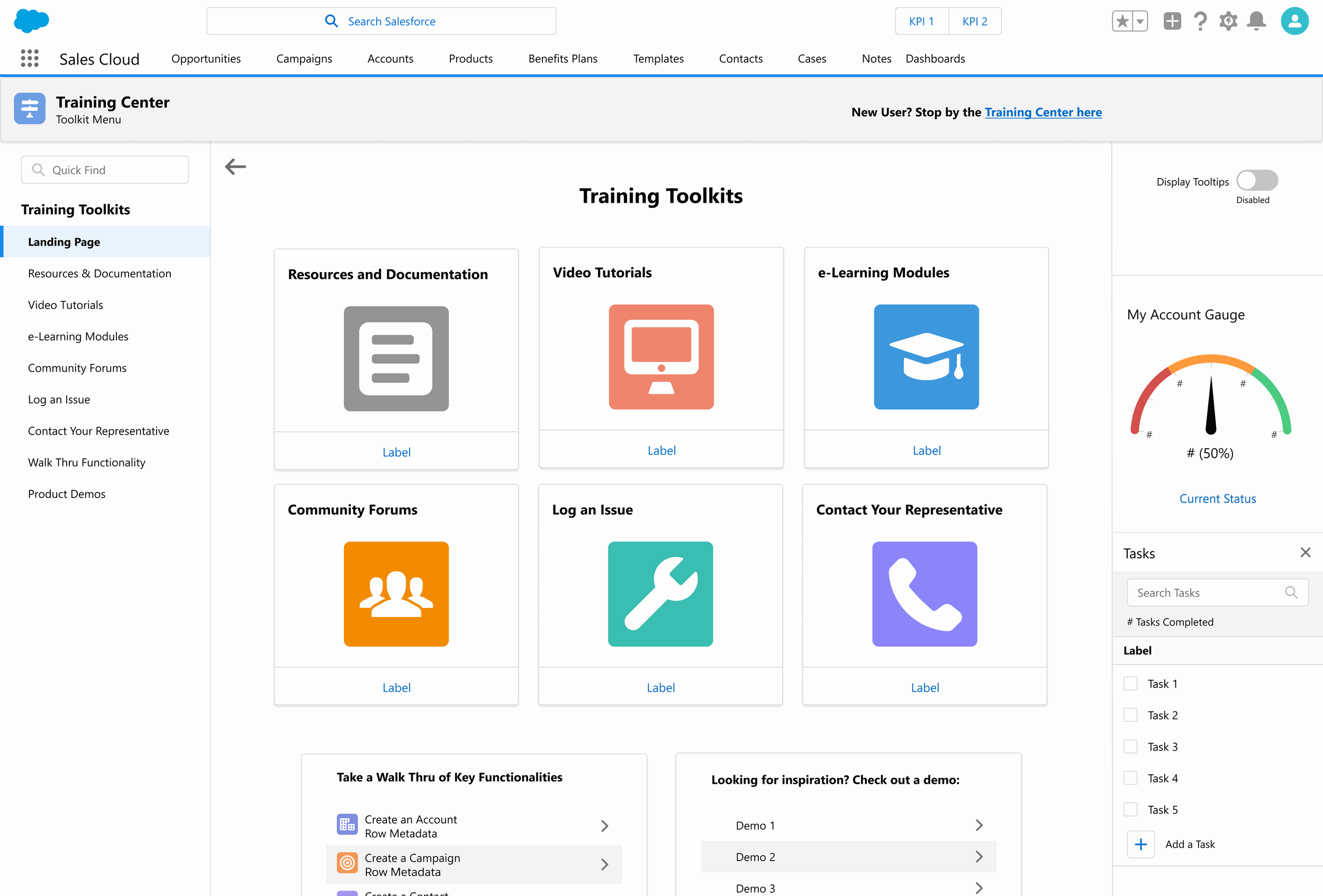
Explore team dashboards with drill-down capability charts on team-specific dashboards. The Training Center provides onboarding resources to help users learn and adopt with ease while gamification and rewards incentivize use.
Design Iterations
Final Content
Navigation
Anticipate Needs
The topmost global navigation contains a global search bar, KPI metrics, and user-specific customizations. Below the global navigation is the app navigation bar contains links to all primary pages of the application. The left side navigation contains hotlinks to the user’s most recently modified or viewed content (e.g. opportunities, campaigns, accounts, and reports).
Team Announcements allow super-users the ability to share important updates teamwide.
Customization
Data Visualization by Group
Custom dashboards provide specific data visualization for each user group. For instance, visuals of Product, Medical Tier, and Plan on the Account level align with Marketing priorities. Filter charts to display Active, Inactive, or All data with radio buttons on the Filter panel below the Team Announcements. Recent activity is logged below the chart visuals for easy reference. Employee adoption metrics and onboarding completion is visible in the Adoption Dashboard.
Actionable
Focus Efforts
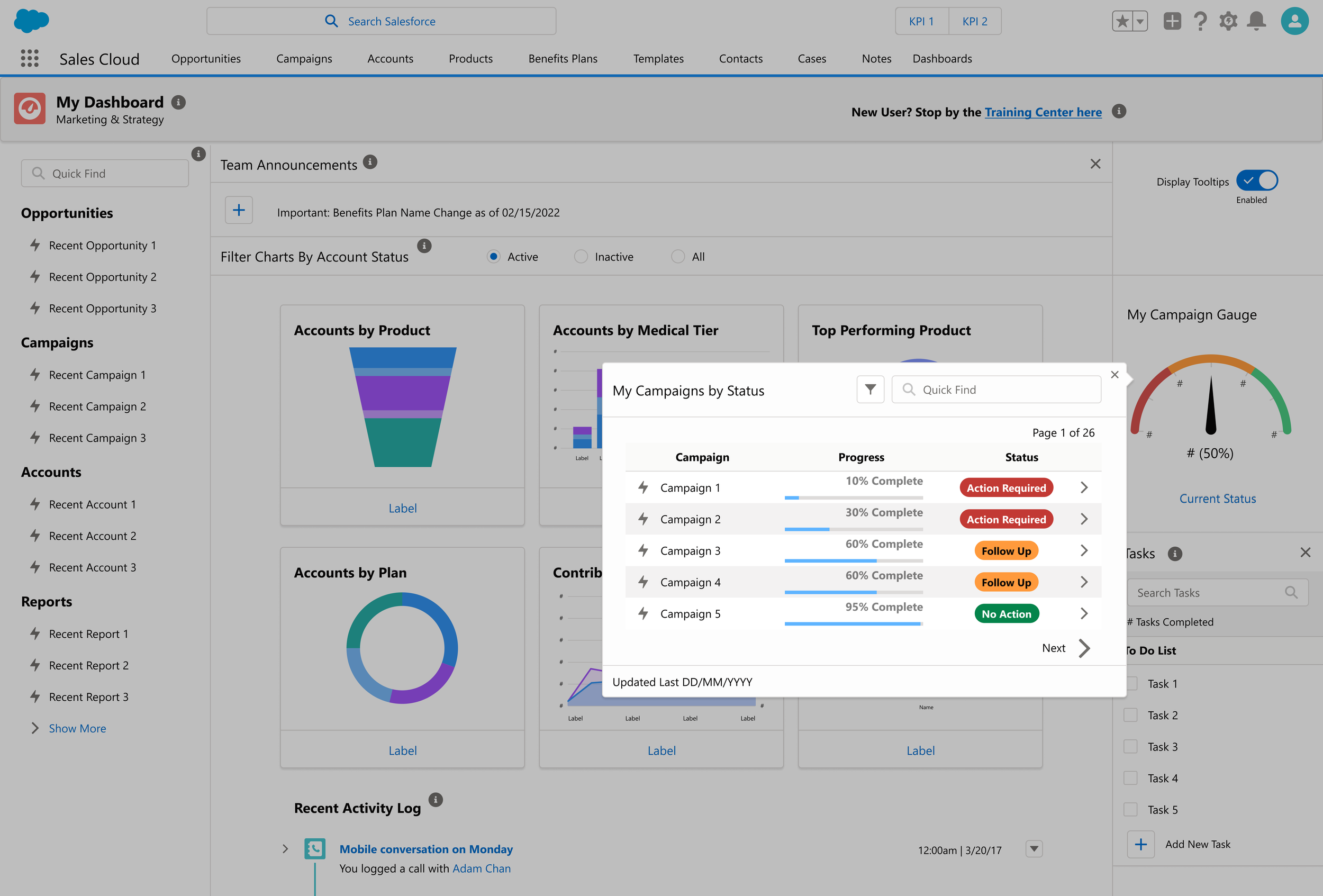
A status gauge displays the health status of projects within a user’s ownership. Status can be configured as Action Required (denoted by red color coding), Follow Up (denoted by yellow color coding), and No Action Required (denoted by green color coding). This quick and intuitive visual indicator shows a user where to focus their efforts. The visual has drill-down capability allowing a user to see the specific status details for actionable next steps. A To-Do list provides task management for quick visibility of workload queue.
Support
Help Format Variety
Users can choose to display tooltip labels on any page by clicking the Display Tooltips toggle from their primary dashboard. Navigating to the Training Center module reveals Resources, Documentation, Video Tutorials, e-Learning Modules, Community Forums, Log an Issue via the IT Help Desk, and Contact Your Sales Representative help portals. Additionally, there are pre-recording videos showing users a walkthrough of key application functionality and demos of other CRM systems to inspire users with ideas for new application features.
Outcomes
WHAT WORKED
Relative content
Left navigation with recently modified content
Enjoys that tooltips can toggle on and off with resources
Activity completion
Discoverability of features
Positive and clean color palette
Good readability app-wide
Access to other groups' dashboards
Frequent reports are helpful (especially if configurable)
AREAS FOR IMPROVEMENT
Tooltips may need training/additional documentation
Adoption metrics depending on job requirements


