Property Tracking Modernization
Challenge: Improve appearance, accessibility, and user experience
Tools:
Miro
Figma
Usability Test
Material Design M3 Design System
Deliverables:
Personas
Site Map
Sketches
User Flows
User Stories
Affinity Map
Wireframing
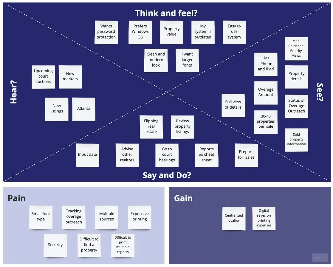
Empathy Map
Interactive Prototype
Role: Lead UX Designer, User Researcher
Timeline: MVP in 2 weeks
Challenge
The property tracking system was built to manage foreclosure properties in review for procurement by the product owner, a real estate broker. The project scope was to update the look and feel for a clean and modern, improve accessibility, and improve the overall user experience for the application.
From user and stakeholder interviews, insights on pain points included:
Difficulty reading small font type
Difficulty locating specific properties
Non-intuitive labels
Outdated look and feel
Time-consuming processes
Solution
The end design includes workflow streamlining, contact outreach integrations, interactive charts, and a more intuitive information architecture. Look and feel is a modern and clean approach with easy-to-read font type and size.

Process
Deliverables
Approach
I reviewed literature on property tracking software along with analyzing competitors in the current marketplace. Competitor insights revealed that common visual format in a map, image, and list view of properties along with more sorting options.
I interviewed the client and gained insights into the desired outcomes. He shared his expertise on his background, process, product expectations, and desirable new features. Noteworthy pain points included poor readability, difficulty tracking customer outreach, and difficulty with data retrieval.
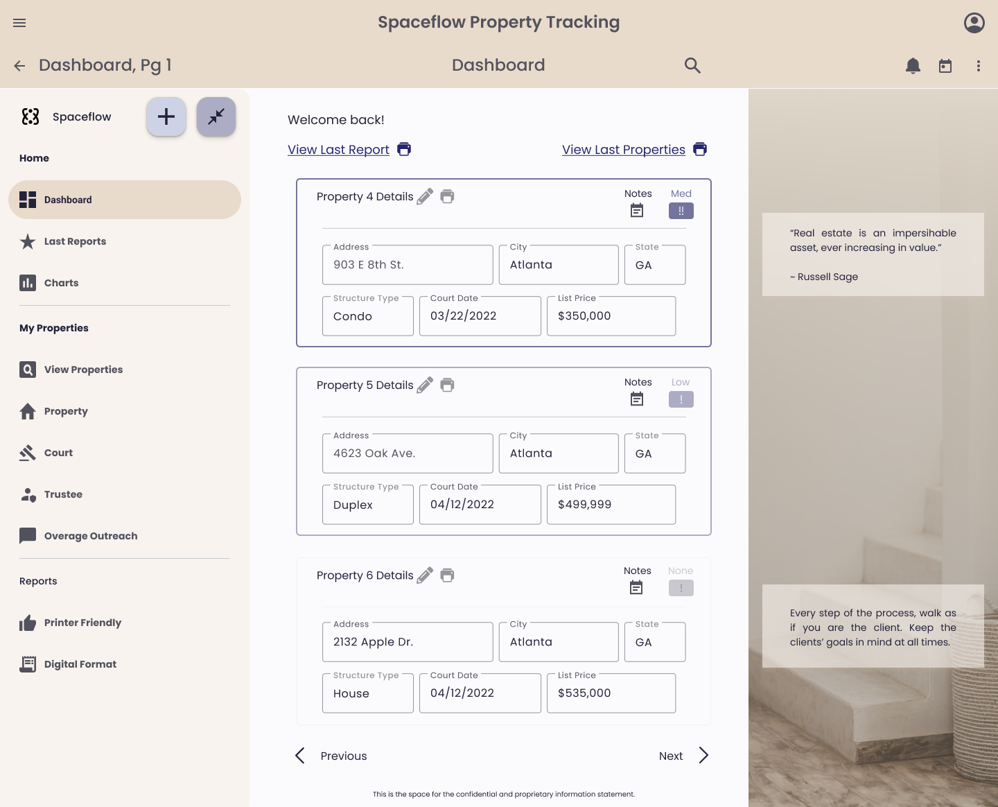
I designed dashboards, view properties view, property details, and reporting pages to provide the team with an MVP design to facilitate decision-making processes on what to implement for development.
-
Product improvement areas from literature insights included product efficiency, product appearance, accessibility, streamlining of workflows, data visualization, simplification of content, and integrations.
Calendar, contacts, email, task management, and phone integrations add value to many real estate process streamlining.
-
Interview insights included appearance changes for a modern and clean look. A primary concern of poor font readability prompted. the request for an easy-to-read font. He currently sifts through pages of properties to locate an item of interest. He requested front-end search and sorting to easily identify properties. He wants to remove properties from the system as he commonly has properties in. the system he is no longer interested in. He wants to contact customers with their entitled overages more easily with the system.
-
User stories, user story maps, empathy maps, affinity maps, red routes, and site maps of the existing and current system provided insights into the design of an efficient system for the client.
User flows of data maintenance, data mining, and other common workflows outside of the system provided insight into optimization.
-
I designed dashboards, onboarding resources, and a file import system from low to hi-fidelity: sketching concepts, wireframing flows, and prototyping an interactive solution. I validated with key users throughout the process.
Framework
User Persona from Interview
-

Real Estate Broker
The client is an older demographic real estate broker and investor. He amalgamates property information for investment review in the Foreclosure Property Tracking tool.
How Might We
How might we streamline the process of amalgamating information?
How might we improve the readability so that the product is universally accessible?
How might we improve the property sale preparation experience at court hearings?
How might we improve reporting capabilities for ease of access?
Jobs to be Done
As a real estate broker, I need to…
Amalgamate property information
Assess return on investment
Procure, renovate, and sell properties
…so that I can optimize my real estate portfolio.
Design
Explore properties in your watchlist, track by priority, view portfolio trends, and print reports.
Clean, Modern, and User-friendly
Track properties in an easy-to-consume modern platform.
Style Guide
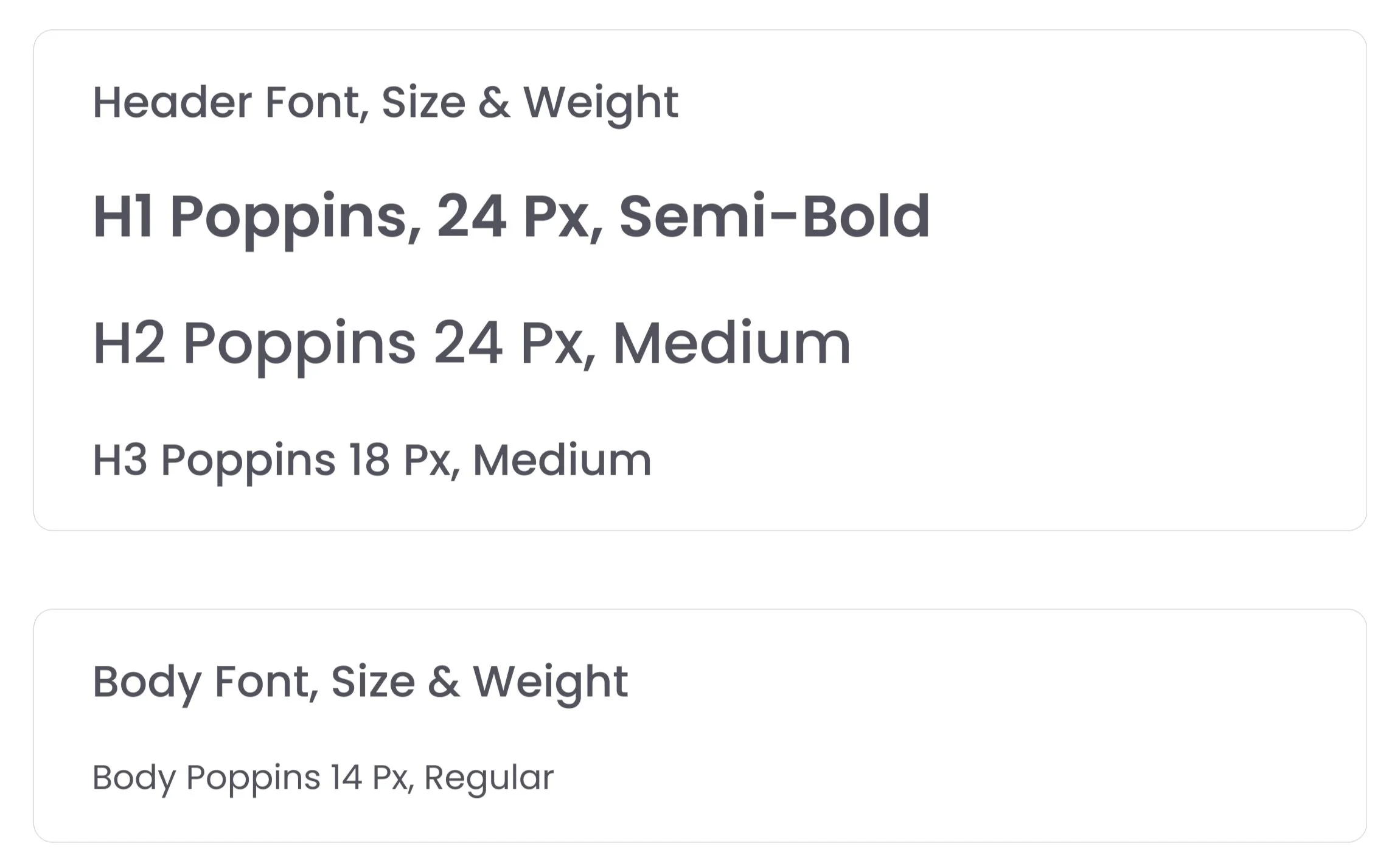
Typography
Legible and Modern
Sans Serif typeface is clean and easy to read and provides a positive impact on accessibility. Poppins, used at a minimum 14 points, optimizes legibility while promoting a clean and modern feel.
Color
Luxury and Sophistication
The color selection within the color palette supports the brand identity and tenants of sophistication and comfort. A dark navy blue hue as the primary color supports the brand identity of luxury and richness. Lighter hues and beiges evoke comfort and relaxation and served as the secondary color and gradients.
Iconography
Recognizable
I utilized solid fill iconography site-wide as it is generally considered faster to recognize as they help users identify character cues more readily (UX Movement).
Desktop Design Iterations
Final Content
Printer-Friendly Reporting
Find Content Easily
Users can search for a property with a global search bar, filter properties by configurable fields, and select the desired properties to print reports for. Additionally, there is a secondary option to print all properties as a report.
Charts
Data Visualization
Users can view their portfolio trends and set time intervals such as weekly, monthly, quarterly, or annually. The visuals include Internal Rate of Return, Cash Flow, Capitalization Rate, and Net Operating Income as charts because these are common metrics for portfolio analysis.
View Properties
Visual Variety
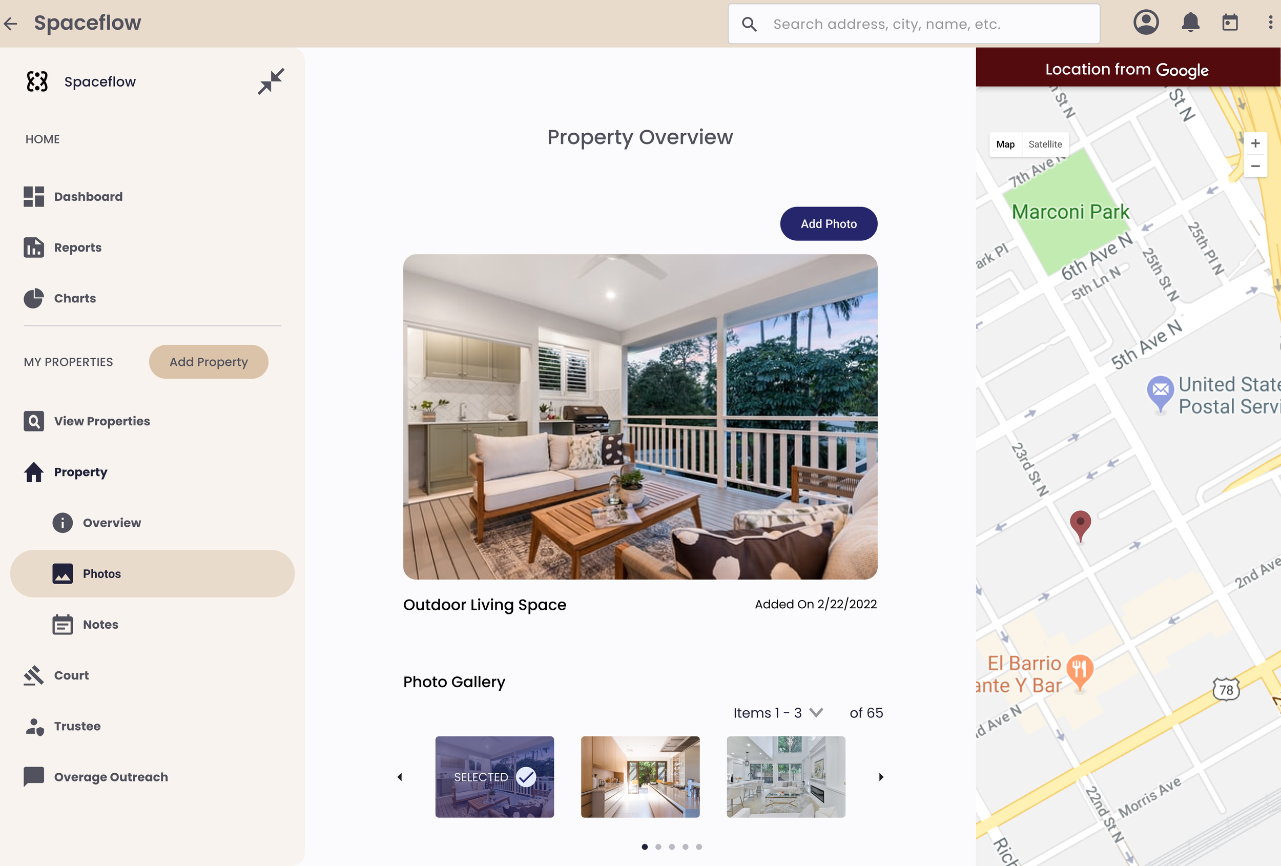
Properties can be viewed in list, image, and map formats. List view shows more detailed content. Images are on tiles with address and sale price. From the map view, properties default as pins on Google Maps and provide the address on hover. Customize the number of items shown per page. Filter content down or search within the top navigation to easily locate a property.
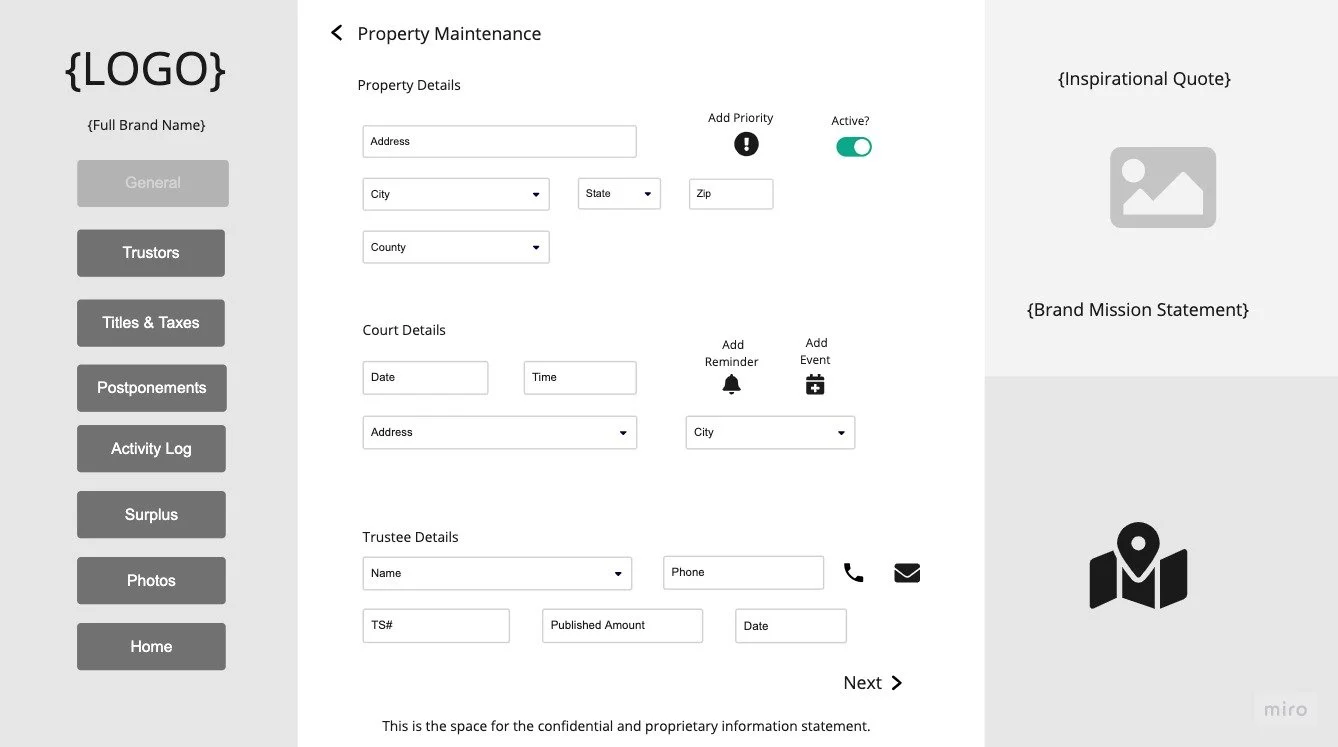
Property Overview
Integrate Common Actions & Reminders
The desktop version allows users to update property details, as it is the most ideal for data entry. Property overview contains property, court, and trustee details. Different priority levels are configurable to easily visualize the level of importance while browsing. Inactivate a property if a property is no longer needed in the watchlist. Set reminders and calendar invites for approaching sale dates to stay on top of procurement. Reach out to trustees in the application with integrated email and phone services.
Outcomes
WHAT WORKED
Variety of property viewing formats (e.g. by image, list, map)
Printer-friendly reporting
Search, sort, and filter options
Navigation improvements
Naming convention improvements
Prioritization, photo upload, and notes
Look and feel
Font
Layout
CLIENT CONCERNS
Preference and cost limitations
Process automation
Integrations
Mobile


