eCommerce Conversion
Challenge: Improve conversion based on dropout analytics
Tools:
Figma
Usability Test
Data Analytics
Material Design M3 Design System
Deliverables:
Personas
User Flows
Affinity Map
Wireframing
Empathy Map
Customer Journey
Interactive Prototype
Role: Lead UX Designer
Timeline: 2 weeks
Challenge
The client sells clean beauty products that include natural and sustainably sourced ingredients. They need to enhance their browsing and checkout experience to improve their product’s usability.
Improve the conversion from browse to completion of checkout to increase revenue on the client’s mobile web experience. Many customers drop out after adding items to their cart, before placing the order.
Solution
Competitor research and data analytics insights heavily influenced the end design. To reduce common pain points experienced in mobile platforms, I critically looked at the number of screens, clicks, and fields required to complete the checkout flow. Users validated the designs and provided positive feedback on look and feel, layout, use of white space, and content. Critiques guided redesign to incorporate user support such as customer service information, more intuitive labeling, layout improvements, and a larger font type minimum to enhance the user experience of the new guest checkout flow.
Process
Deliverables
Competitor Usabality Report (Incognia, 2021)
Customer Journey Map
Approach
I reviewed literature about eCommerce checkout optimization and analyzed competitors in the current marketplace along with usability test reports. Sephora is the leading beauty shopping platform per a thorough usability study, so I leveraged its design for inspiration.
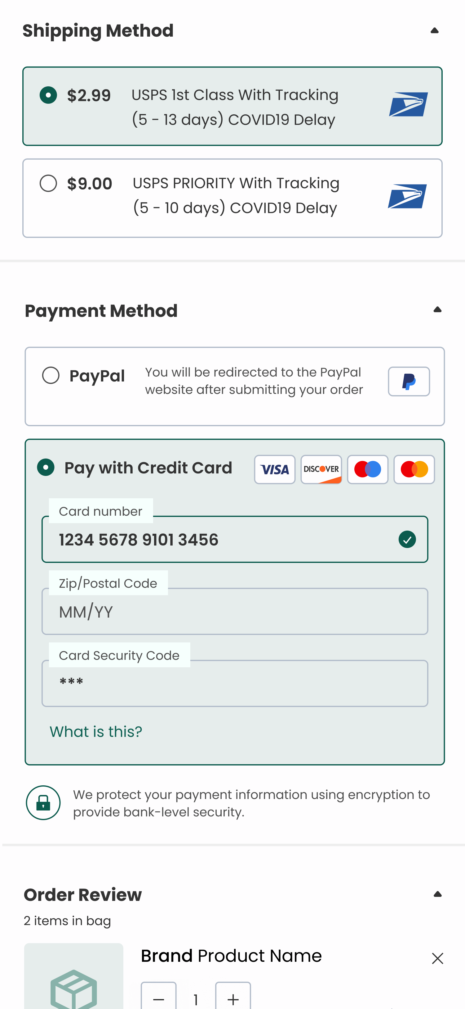
Consumer expectations include intuitive labeling and visual indicators of security.
I reviewed the data analytics provided by the PM. Data shows that users abandon the cart at the registration page. Currently, users must make an account to purchase.
50% of users open on average 7 item pages and then abandon the site without moving any items into the cart.
70% of users who place an item in the cart do not purchase
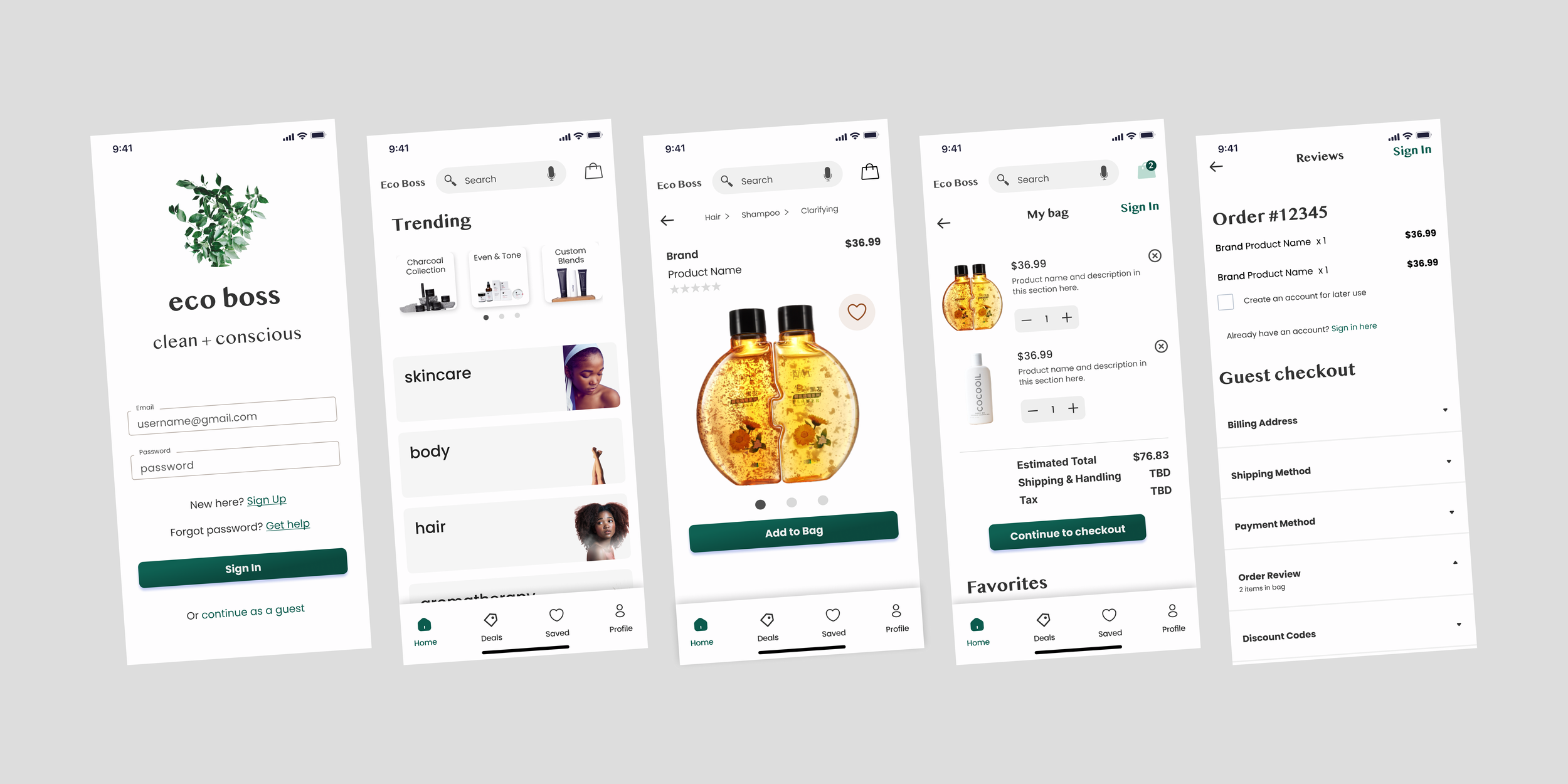
I designed product browsing, product detail, order review, and guest checkout pages for validation with pre-screened eCommerce consumer participants.
-
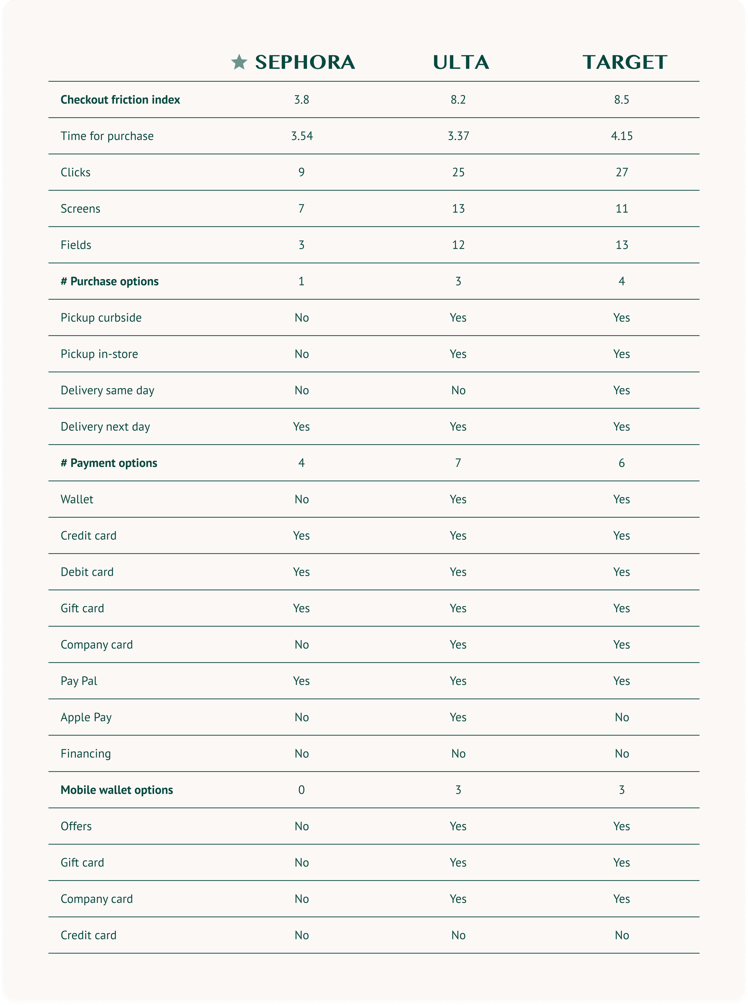
Icognia Mobile App Usability Report 2021 revealed that Sephora has the lowest checkout friction when measuring time for purchase and the number of clicks, screens, and fields.
-
The display of trust badges and logos increases brand trustworthiness and perception of data security. Modern consumers expect frictionless experiences. A quality modern design anticipates common behavior with defaults to add ease. Label intuitively to prevent confusion and build trust with consumers.
Data analytics show that shoppers drop out of the checkout flow after the discovery of multiple items. The assumption is that there is difficulty distinguishing key differences between items and therefore shoppers abandon the site due to content overload. Shoppers who drop out with an item in the cart may be due to the checkout flow as it is not currently optimized for guest checkout.
-
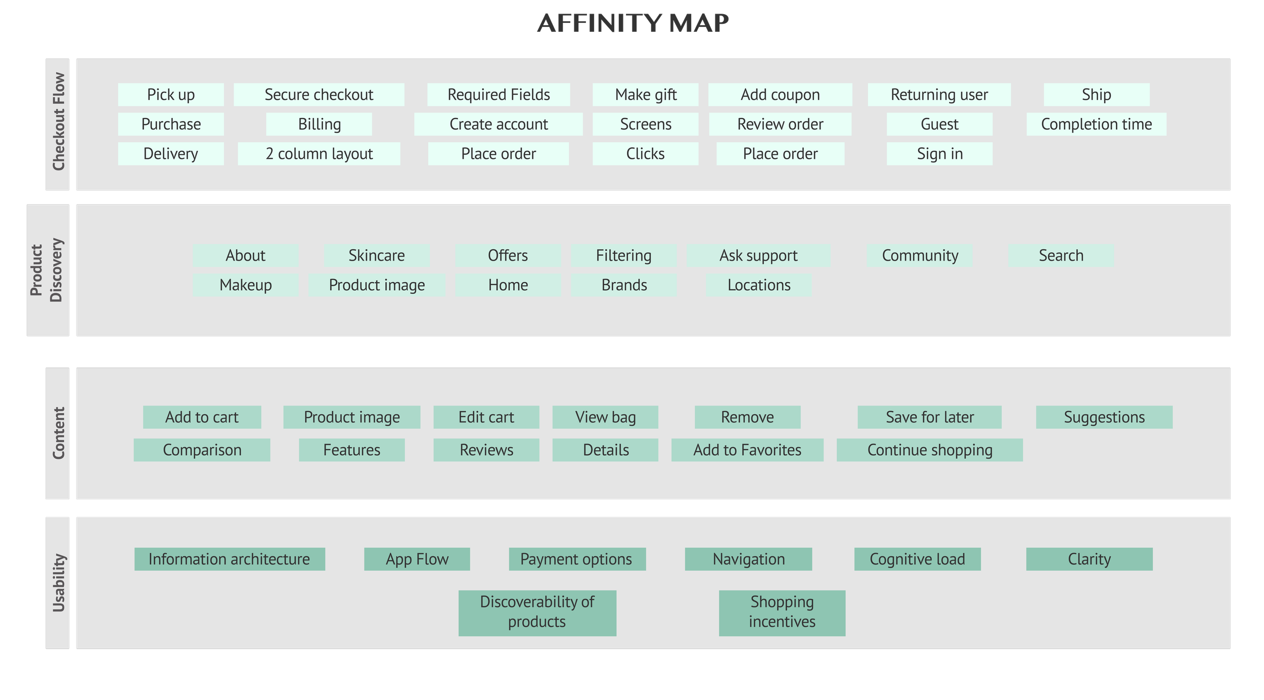
Customer empathy maps and affinity maps to map out consumer insights. Customer journey mapping to optimize the discovery and checkout flows.
-
I designed the guest checkout flow and product discovery optimization from low to hi-fidelity: sketching concepts, wireframing flows, and prototyping an interactive solution. I validated with key users throughout the process.
Consumer Personas
-

Clean Beauty Shopper
The customer demographic is under 35 years old making them 24% of U.S. adults. They live in an urban environment, have mid to high-income earners and are college-educated. They are collectively multicultural and support sustainability, clean, and green companies.
Framework
How Might We
How might we improve conversion from dropout after viewing multiple products without adding them into the bag for purchase?
How might we improve conversion from dropout after adding a product to the bag?
How might we improve the process of product discovery?
How might we improve the checkout process?
Jobs to be Done
As a shopper, I need to…
Discover products
Compare products
Add product to bag
Checkout as a guest
Review order
Enter shipping
Enter billing
Place order
…so that I can order products without extra steps like signing in.
Design
Clean beauty eCommerce shopping flow from product discovery to checkout. Checkout now includes an optimized guest checkout flow for shoppers.
Deep Product Insights
Shop with product comparisons, customer reviews, and infographics to highlight key product differences. Guest checkout allows for a seamless checkout without having to sign in or up.
Design Iterations
Final Content
Intuitive Labeling
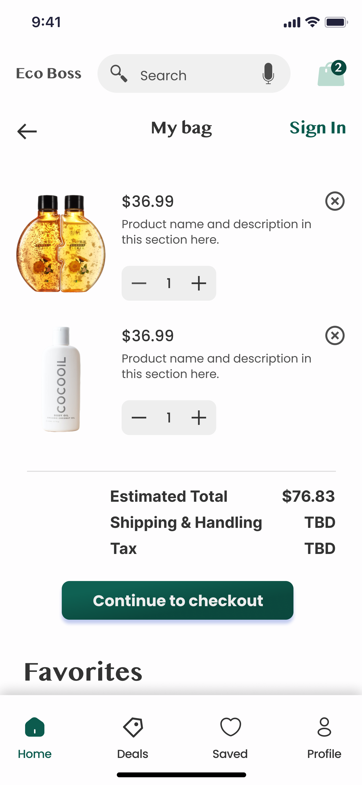
Display Added Expenses
In previous versions, the My Bag screen did not display the breakdown of the different Shipping, Handling, and Tax lines in addition to the estimated total. Shoppers must enter in their address for an accurate estimate, so it is difficult to estimate prior to the near end of the flow. Including the label helps shoppers to anticipate these charges in upcoming steps.
Linear Process
Visualize Every Upcoming Step
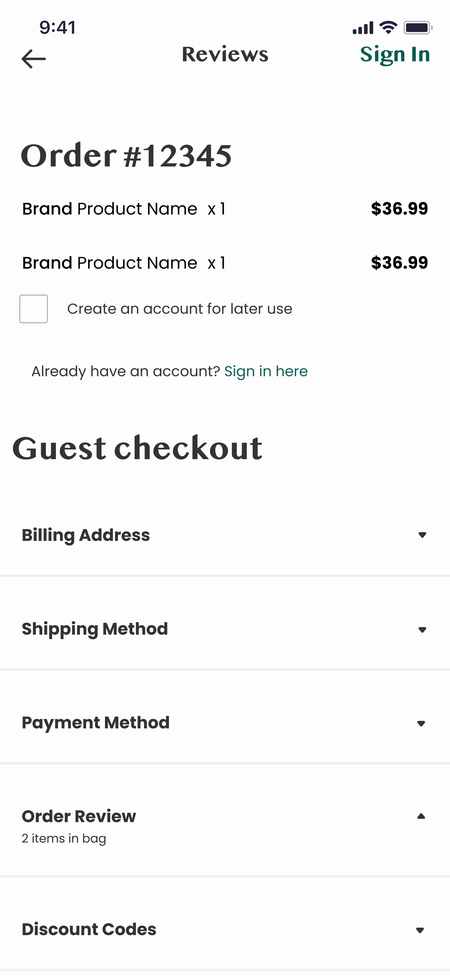
The guest checkout flow is a linear and natural flow. It is easily discoverable as shoppers can continue scrolling and filling in their information without redirecting to new screens for guest checkout. The guest checkout option is the primary flow as it is seen within the first half of the screen.
Sign In Options
Provide Multiple Opportunities
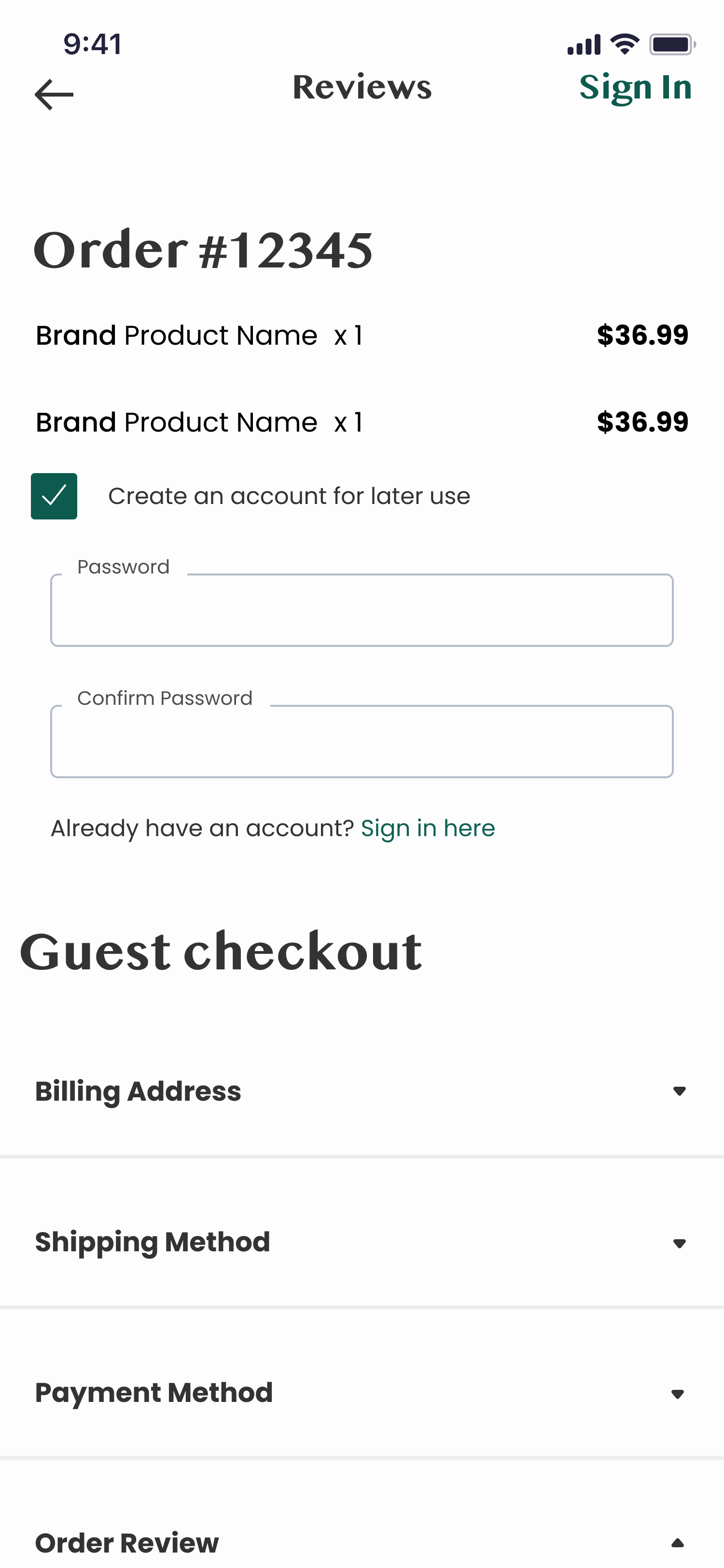
There are opportunities to Sign In throughout the entire shopping experience. Sign In is available from the app welcome page and throughout all pages in the top navigation bar. If a shopper wants to create an account, they can do so from the initial welcome or within the checkout flow by tapping the Create an Account checkbox. Customers have options to stay connected all along the flow.
Defaults
Align with Common Behavior
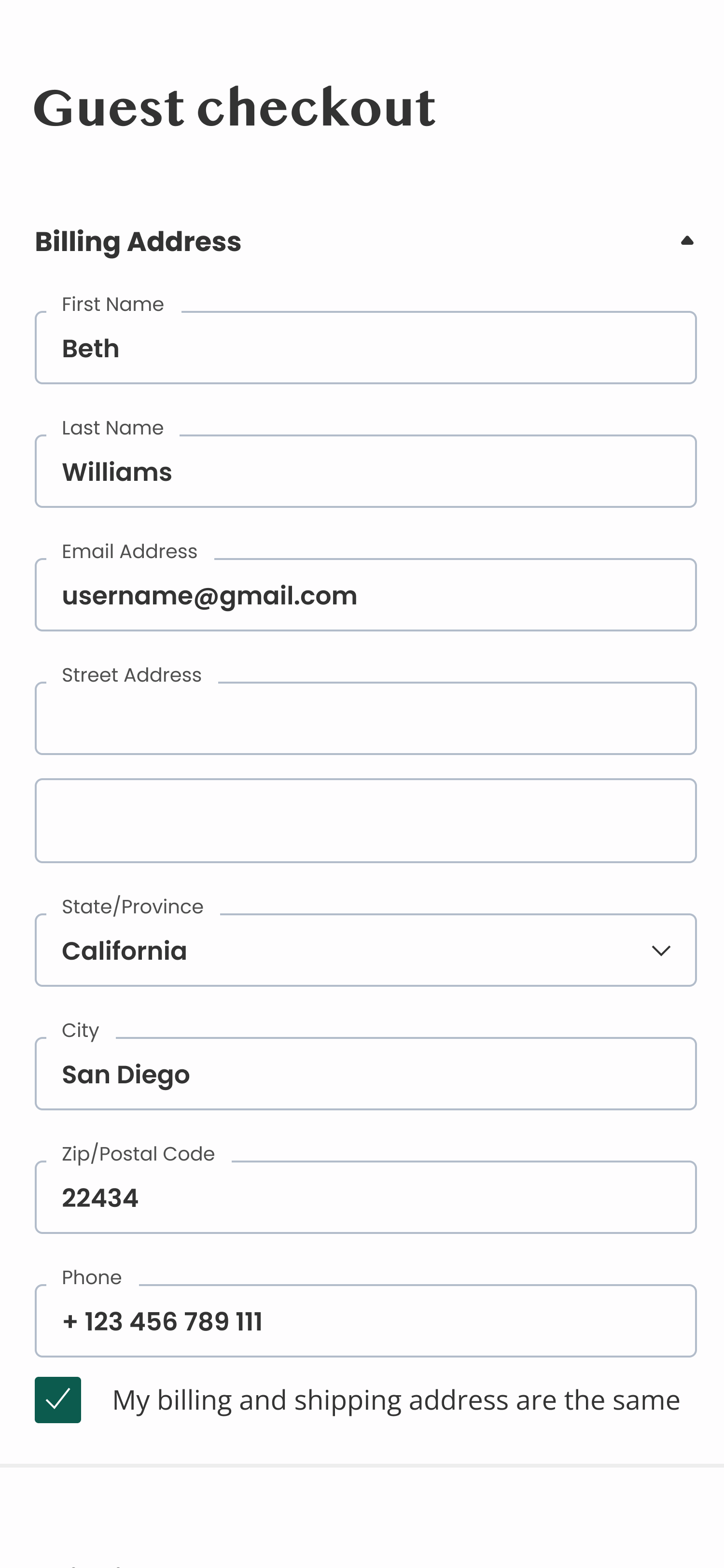
Geo-location defaults can estimate where the shopper is located by their device. Leverage technology and save customers time during what they consider to typically be a time-consuming experience. Defaulting the shipping address from billing also added a positive impact for a time-saving perspective.
Build Trust
Recognition of Secure Practices
Trust badges and logos to increase the perception of trustworthiness and show that the data collected is safe. It adds a layer of perceived security. According to a study by Actual Insights, the majority of participants said the trust logos increased the perceived trustworthiness of a brand and even recalled a time when they chose not to complete a transaction because trust logos were absent.
Outcomes
WHAT WORKED
Trust badges and logos for a secure feel
Intuitive labeling to avoid confusion and misleading consumers
Default common behavior improvements
Give options
Product discovery content
Look and feel
Font
Layout
AREAS FOR IMPROVEMENT
Avoid defaulting added expenses like a warranty
Placeholder text and lorem ipsum confusion


